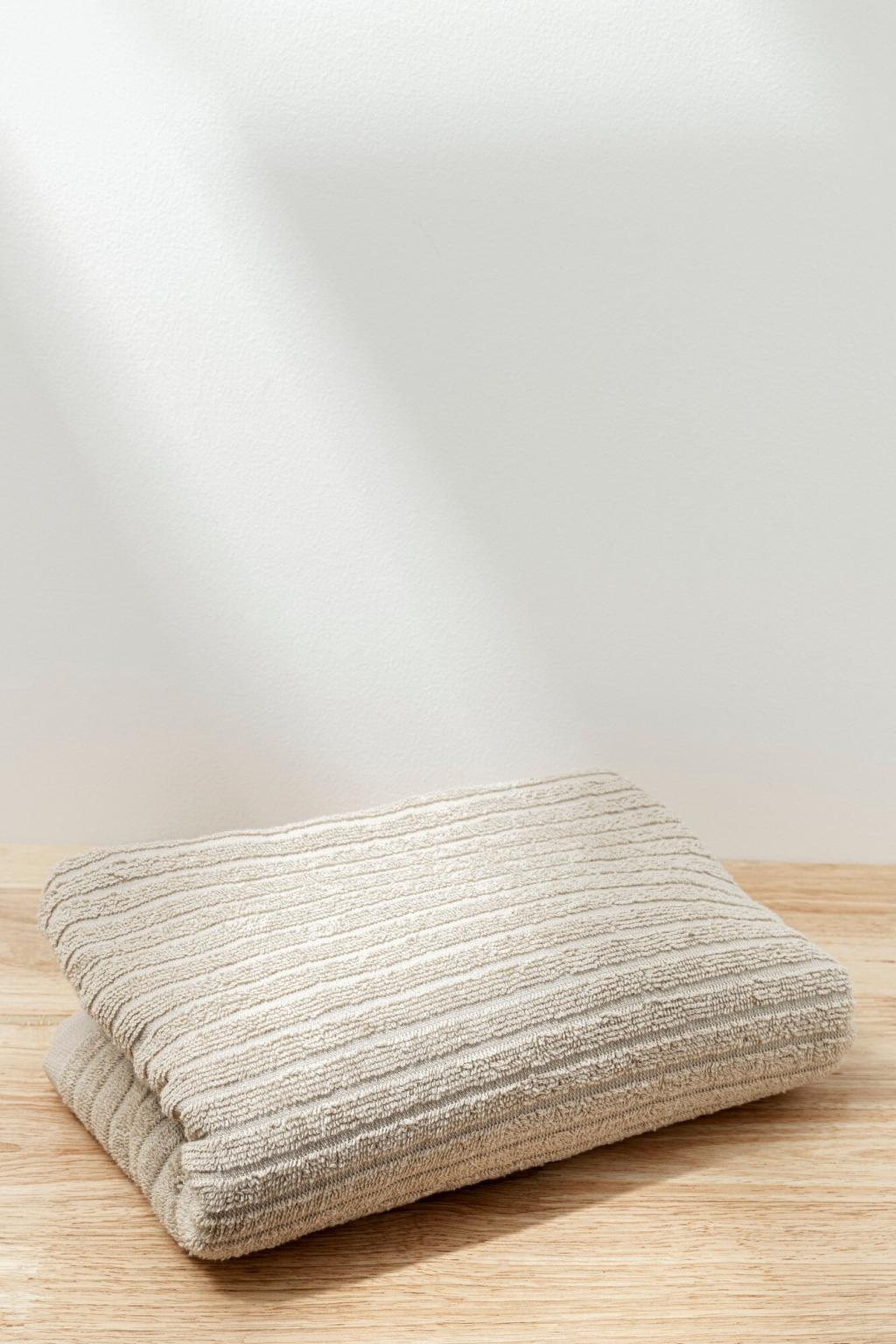

Lighting: The Hidden Partner in Color and Texture
North light cools colors and flattens texture, so introduce warmer hues and tactile fabrics. Southern exposure intensifies saturation; offset it with chalky finishes and breathable weaves to avoid glare. Test swatches morning, noon, and dusk before committing.
Lighting: The Hidden Partner in Color and Texture
Choose bulbs with a high CRI so blues look true and wood tones stay honest. Warm-white bulbs complement earthy palettes and soft textiles; neutral-white supports crisp palettes, metal finishes, and stone. Dimmer switches let texture and color shift gracefully.