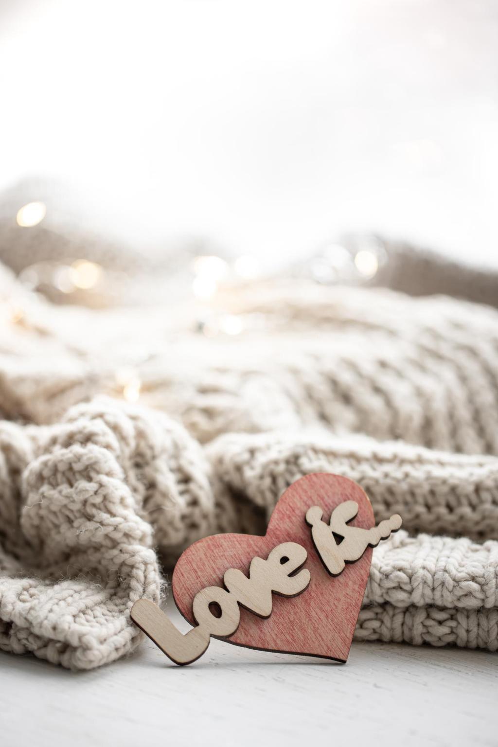
Chosen theme: Choosing Fabrics: A Guide to Color and Texture. Welcome to a warm, tactile journey through hues, fibers, and finishes—where your eye for color and your hand for texture learn to speak the same creative language.
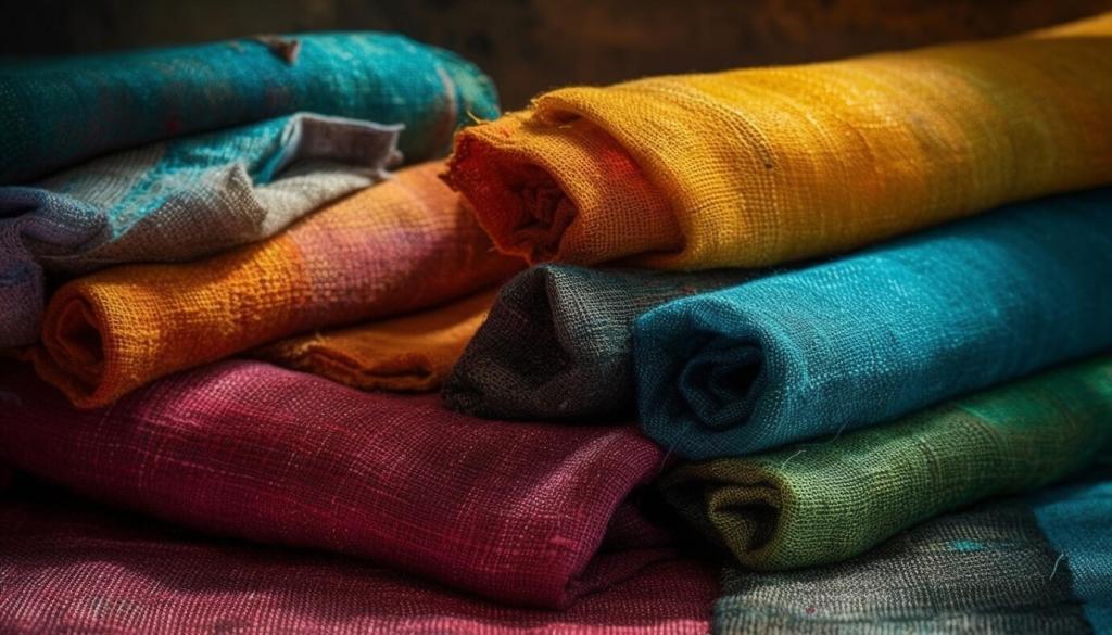
Warm reds can look richer on a napped velvet while cooling slightly on a crisp poplin, because pile depth absorbs light differently than flat, tightly woven structures. Test swatches together to see interplay rather than guessing alone.
Color Theory You Can Feel
High-saturation fabrics make bold statements but show wear faster, especially on textured knits where pilling dulls intensity. Lower-value neutrals hide daily life better, yet still benefit from nuanced undertones that keep them visually alive.
Matte twills mute glare and enrich color depth, while sateens reflect highlights that lighten the perceived tone. A subtle basketweave scatters light, softening sharp contrasts and making bold palettes feel more approachable in everyday wear.
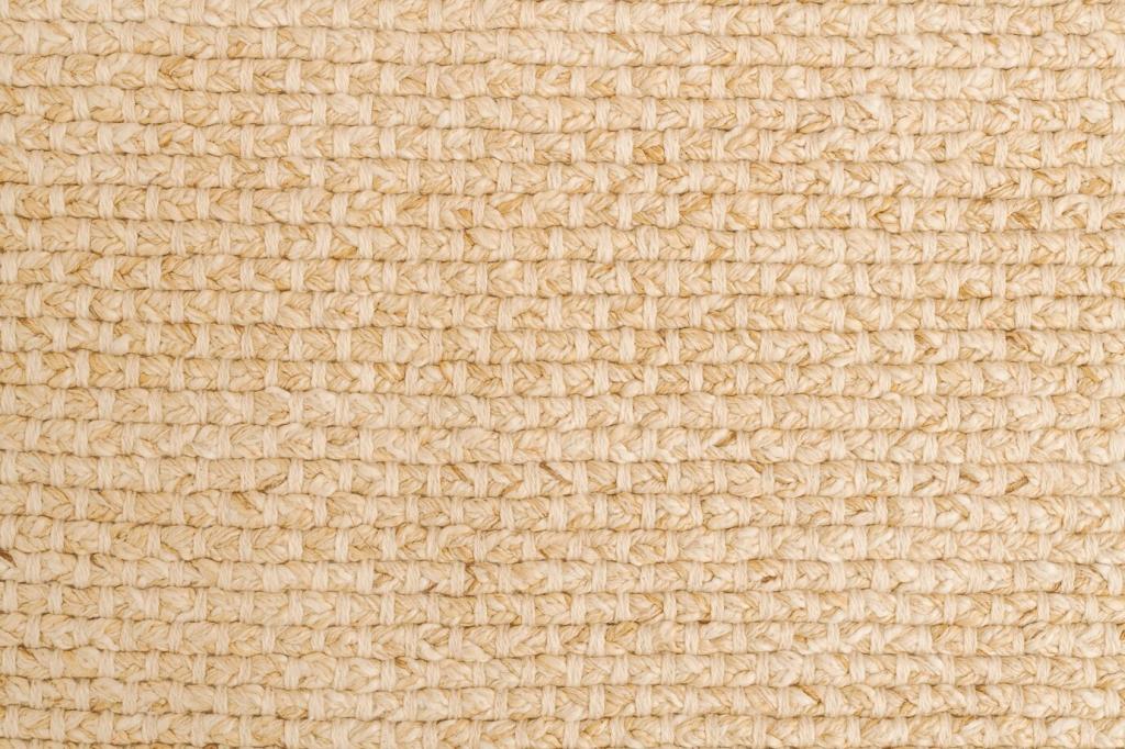
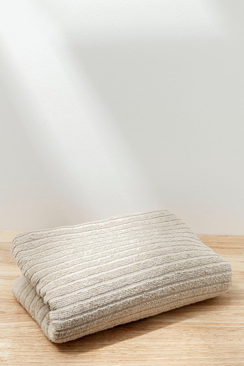
Cotton accepts color evenly but softens with wash, while linen’s slubs create organic highlights that enliven neutrals. For airy summer projects, their breathability elevates comfort without sacrificing the layered interest that texture naturally provides.
Wool, Silk, and Luxe Dimension
Wool’s scales diffuse light for mellow hues, and silk’s filament shine intensifies tones like a built-in glaze. Blends can balance luxury with practicality, letting you keep glow and drape without compromising resilience in everyday use.
Swatching, Lighting, and Real-Life Tests
Daylight vs. Indoor Bulbs
Under warm LEDs, cool grays can feel slightly taupe, while midday sun crispens edges and reveals true undertones. Tape swatches by a window and under your most-used lamp, then photograph in both conditions to compare with fresh eyes.
Movement and Drape Trials
Pin the swatch to a hanger, flick it, and watch the fold patterns. A heavier crepe may swallow prints in shadows, while a lighter lawn keeps motifs legible. Record a short video to see how color pulses during motion.
Wash, Rub, and Pill Checks
Rub two swatches together for thirty seconds and inspect fuzzing. Lightly launder test pieces to gauge fade and hand-feel changes. Your favorite palette should also be practical, surviving real routines without losing its intended character.
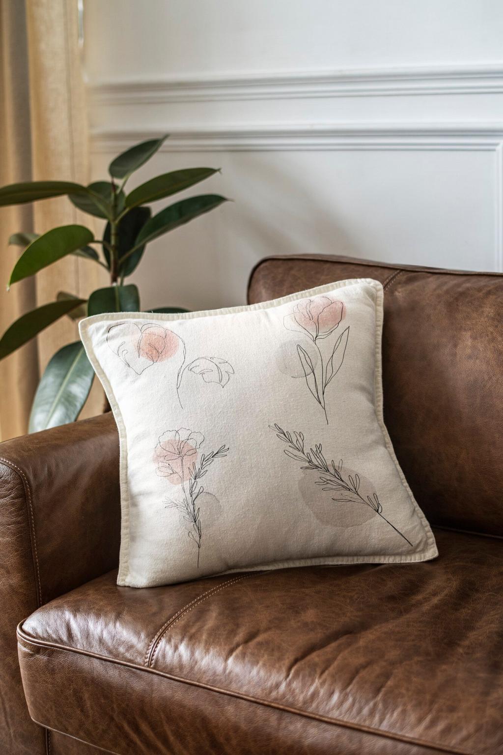
Building a Cohesive Fabric Palette
Choose two dependable neutrals—a matte twill and a slubbed linen—so combinations never feel flat. Texture provides depth where color recedes, making even monochrome outfits or interiors look considered rather than unfinished or purely utilitarian.
Cold, gentle cycles protect cotton saturation and minimize agitation that raises fuzz on knits. Wool prefers cool hand-washes; silk likes delicate detergent. The right routine saves color clarity and keeps textures behaving as intended.
Maya swore off yellow until she tried a marigold crinkle gauze; the texture softened brightness into sunlit warmth. She wore it to a picnic, received five compliments, and now pairs it confidently with olive and denim.
Community Stories and Next Steps
Pick three textures in the same color family and compare them in morning, noon, and evening light. Share your notes in the comments, ask questions, and subscribe to get our printable swatch scorecard delivered to your inbox.